Feeds
2024-06-04 14:03:00
Introduction
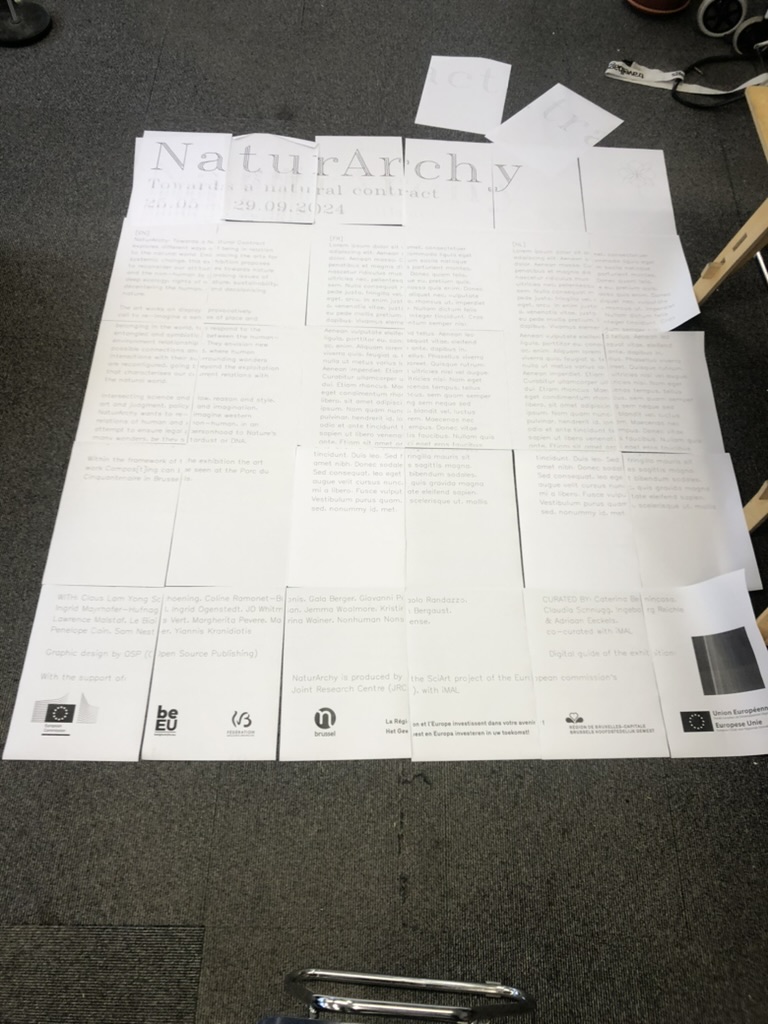
OSP were commissioned by iMAL to design a graphic identity for the exhibition NaturArchy: Towards a Natural Contract, taking place in Brussels, from the 25.05 till 29.09.2024.
As the exhibition is comprised of art/science collaborations on the theme of nature, we began with an intention to experiment with pen plotters and bio inks. The bio inks were previously used in a 2018 collaboration between OSP and María Boto Ordonez, a scientist working at the Laboratorium.
Pen plotters
A pen plotter is a machine that draws. Or rather, a machine that takes instructions to plot coordinates on the x- and y- axes with a pen, while it is up or down. These machines pre-date the modern office printer as a way to output vector graphics on paper.
Using a pen plotter is a slow, musical process. We found the "songs" it made came from the shapes it was drawing - the pitch depending on the angle of the line. A plotted circle (which is in reality not a continuous curve, but rather a series of small increments of points) produced a musical run through a wide range of notes. Often we could know which drawing it was making by the song it was playing. Drawing the same shape (for example a flower) in two different sizes, would create the same melody but at a different speed, the small flower playing at a higher tempo.
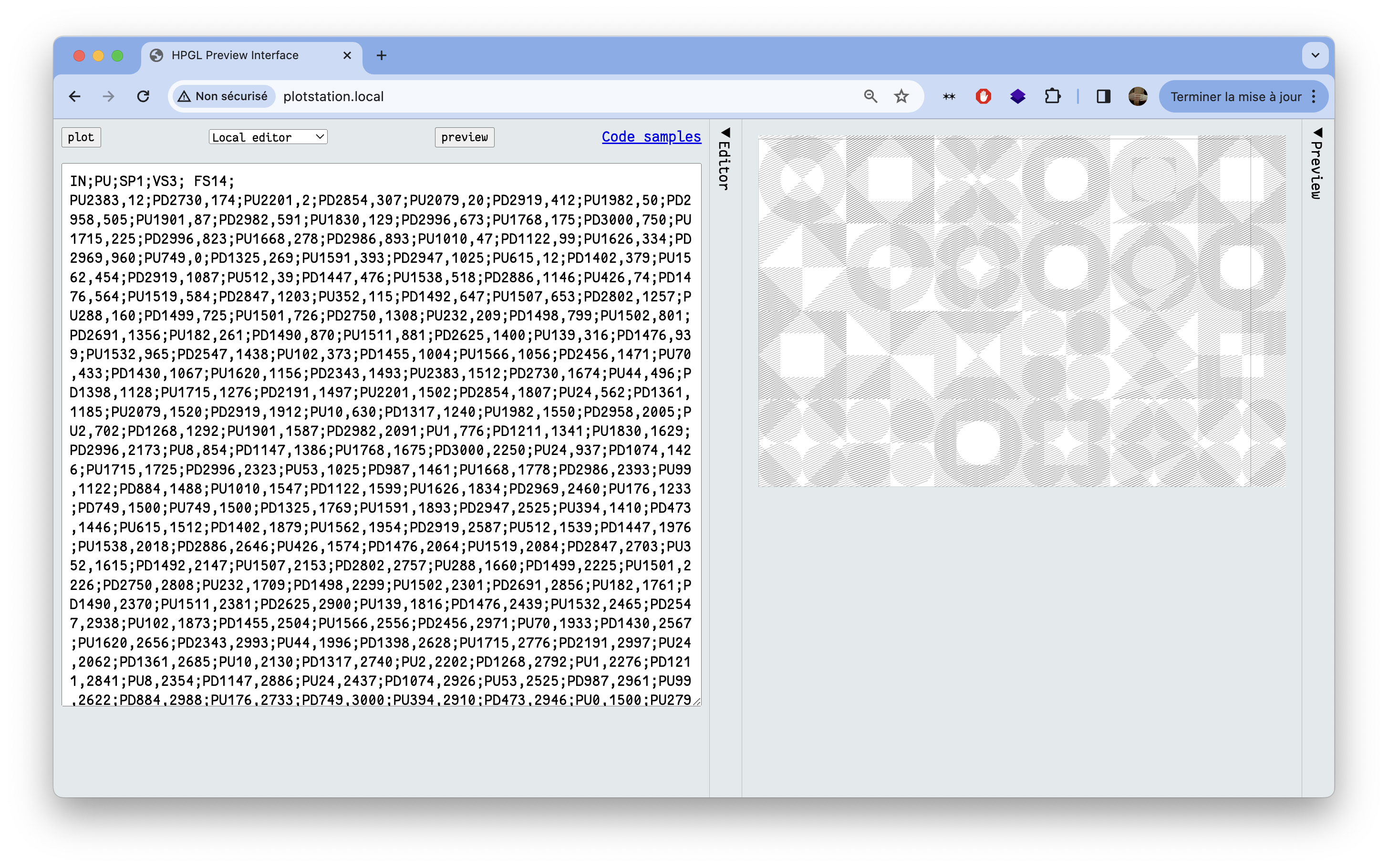
Pen plotters speak a language called HPGL (Hewlett Packard Graphics Language), which has a relatively simple syntax. HPGL uses commands such as SP (Select Pen), PU (Pen Up), PD (Pen Down), PA (Plot Absolute), PR (Plot Relative) and LT (Line Type). For very expanded documentation, the Isoplotec website is a good resource.
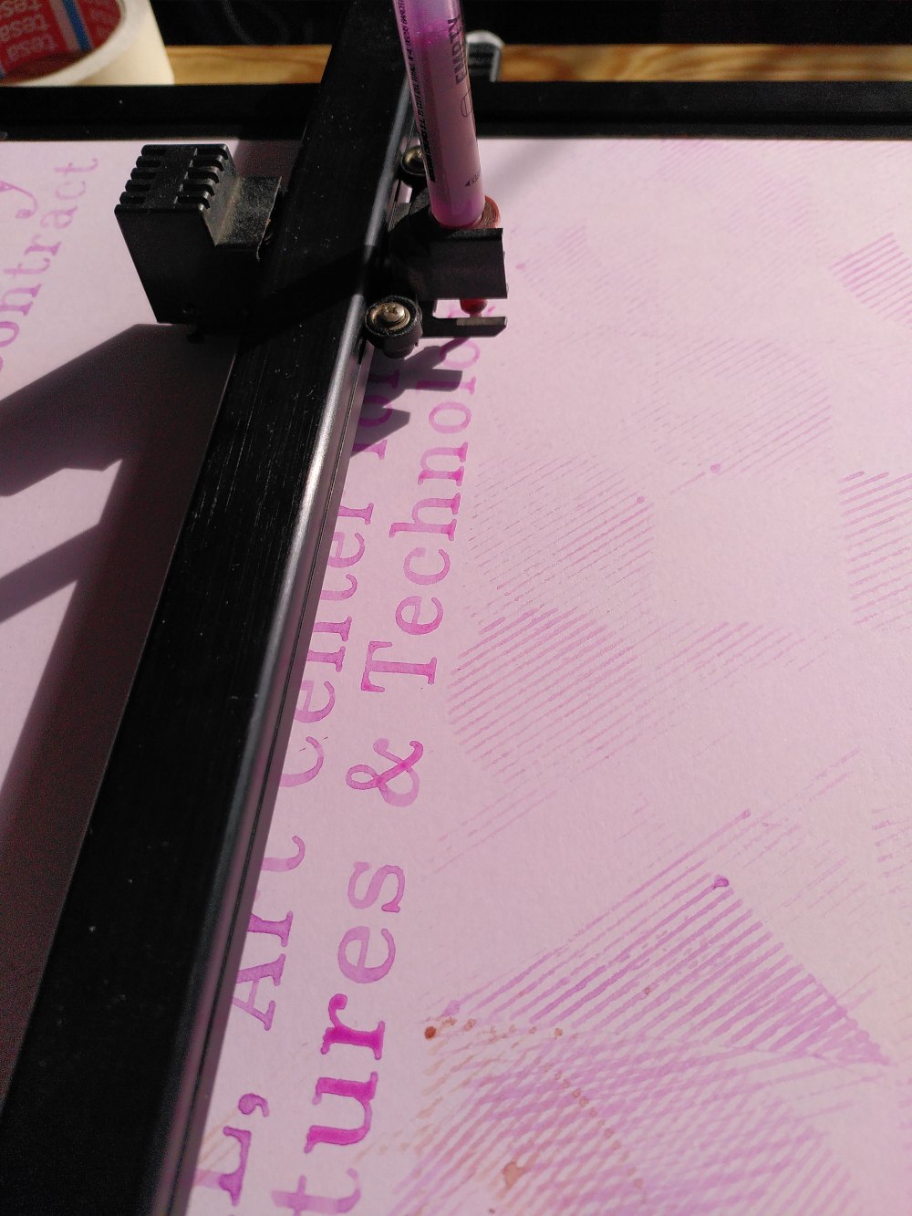
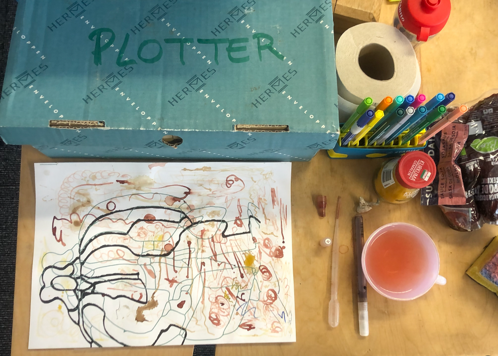
There is quite a collection of pen plotters available to use within the newly-created plotter station at OSP. The machine that we used was a Roland DXY-1100. It holds A3 sheets of paper electrostatically in place for a pen to move over it. After the machine is initialised, the plotter picks up a pen from one of eight slots in the carousel. The thickness of the lines it will draw depends on the type of pen, and specifically the width of its nib. We used both commercially manufactured Stabilo brand pens for synthetic ink and refillable pens to hold the bio inks. As the pens we were using were not manufactured specifically for pen plotters, we had to fit a 3D-printed adaptor that the machine would be able to hold. Several methods for making fine adjustments in the vertical alignment have been improvised by other pen plotter enthusiasts, such as the students of XPUB (Experimental Publishing) Master at the Piet Zwart Institute in Rotterdam. We did not have such a vertical alignment tool, but instead improvised with masking tape, trial and error.
It’s hard to seek total control and perfection with the pen plotter: sometimes it’s not grabbing the pen, it’s pushing too hard, sometimes the bio inks are too dry leaving no mark, or too inky creating liquid stains. It is this uncertainty we cherished but which also required us to stay next to the machine all the time, either fixing the mistakes by hand, or embracing them and watching them happen, mesmerised. After some time, the pen plotter felt like a companion or a pet, that we had to feed and take care of. It had its own personality, being always surprising and nonlinear. We caught ourselves several times silently smiling and observing its every move, rocked by its melody. Like a proud parent, our phones were full of videos of its actions.
Bio inks
The bio inks we used for this project are created by María at the Laboratorium, a biolab located within the Media Arts Studio at the Royal Academy of Fine Arts (KASK) in Ghent. They are made with natural pigments and algaes, and they naturally disappear when placed in direct exposure to sunlight. We decided to work with this ephemerality, imagining having posters with some details almost completely faded out by the end of the exhibition.
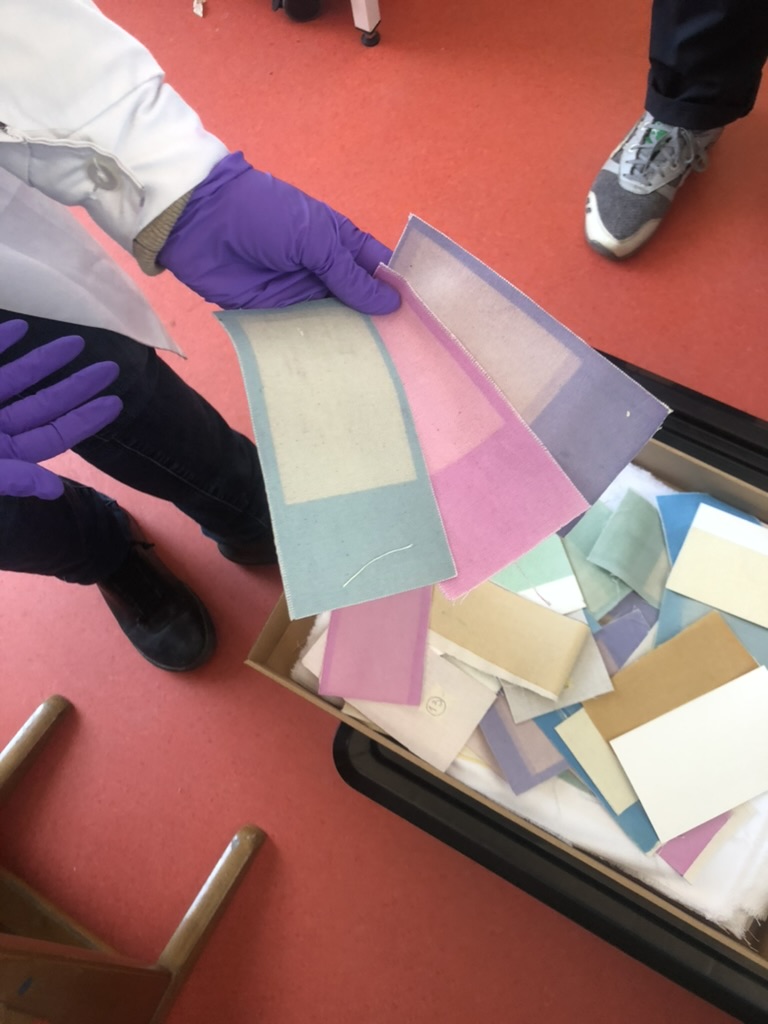
Before visiting María’s biolab, we made some experiments by plotting with “natural” inks we made from materials we found at the OSP studio: soy sauce, turmeric and coffee. The result was exciting but very pale and only brownish in hue. The aspect of these inks when used on paper is very close to watercolour, it’s very pale, fluid and had a fragile feel.
At her biolab in Ghent, María generously gave us some new bio inks: a very bright pink, a deep blue, an orange and a green, which were much more interesting to work with. Because María is working more with structured color these days than with bio inks, she still had some reserves left over.
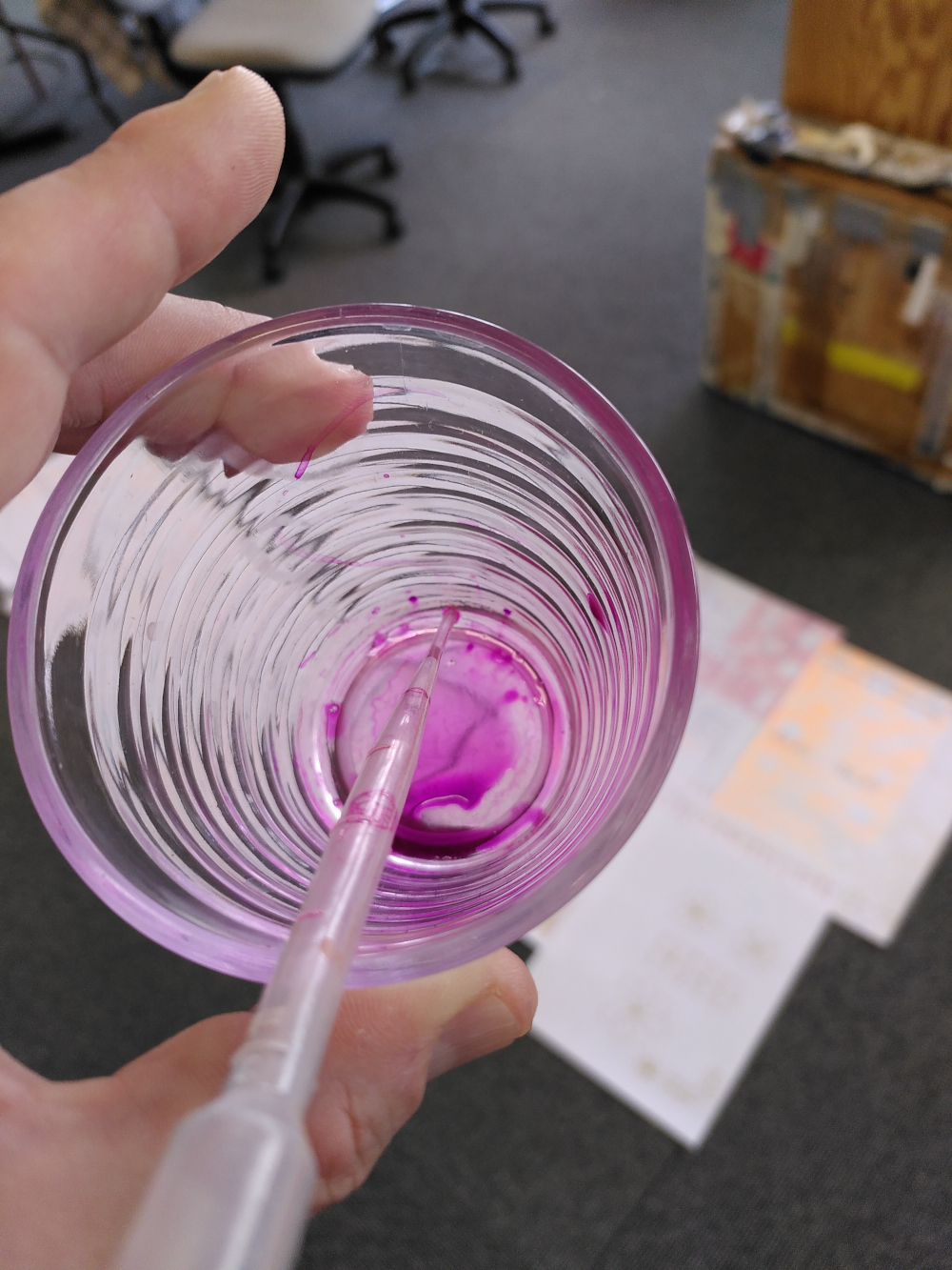
Some inks worked great and without needing close assistance, for example the pink was very fluid but dense and the result was very bright. In contrast, the green was hard to mix and was very pale, almost invisible. The timeframe for this project was super short, so we didn't have much time to experiment. With more time we'd like to dig a bit deeper into different fluids to mix the pigments with (such as alcohol, or oil).
The poster series
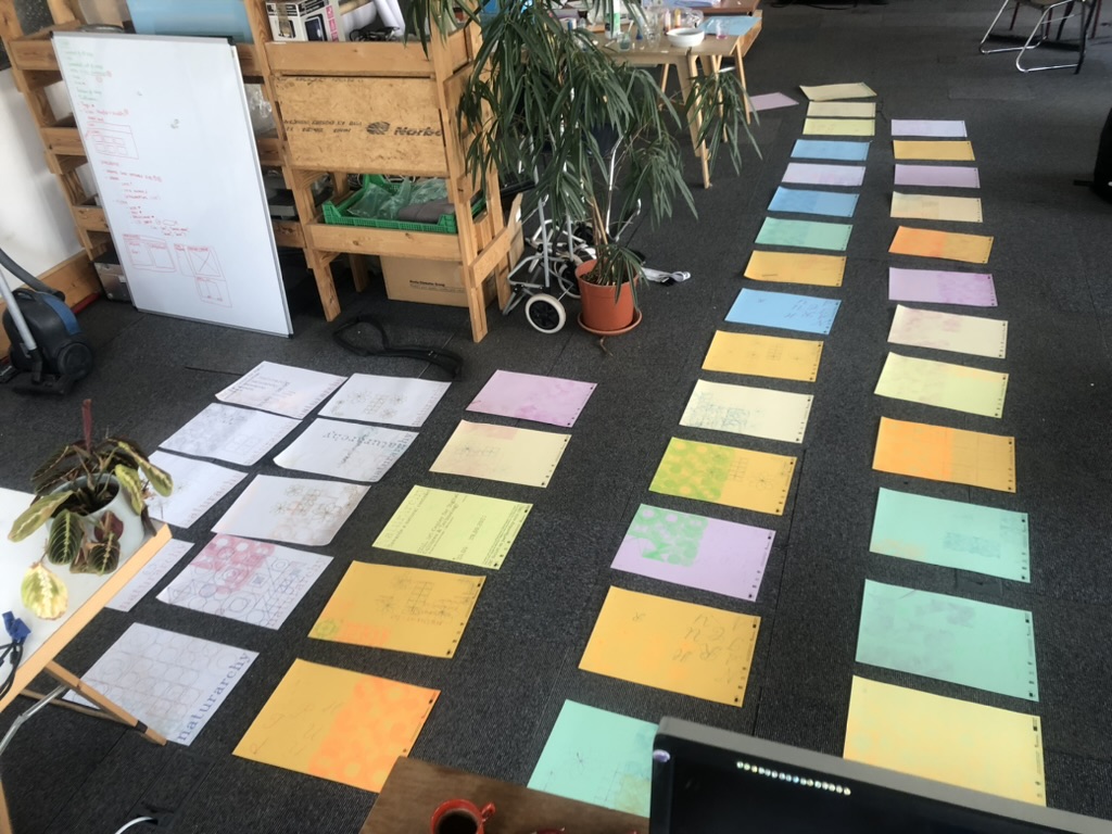
Our initial research involved trying out making patterns that used the shapes of iMAL's identity (circle, square, triangle, diamond). These shapes provided a basic starting point from which to understand HPGL. To draw a line, the pen plotter needs instructions where to take the raised pen to. These come in the form of a direction to move the raised pen to a set of coordinates. Then a direction to put the pen down and move it to another set of coordinates. In this way, the machine uses HPGL to draw the outlines of shapes, and crosshatch fills for them.
We generated patterns in HPGL using a python script. These created a series of moiré effects that we could directly send to the pen plotter. We tried also with a stereotypical flower drawing, using only basic curves, and other typographic experiments. The fonts we used come from the Hershey typeface. These were generated from an extension of the software Inkscape. We chose to use Hershey fonts as they are monoline fonts, meaning that they are composed from lines. This makes them therefore suitable for a pen plotter, which draws lines but not fills.
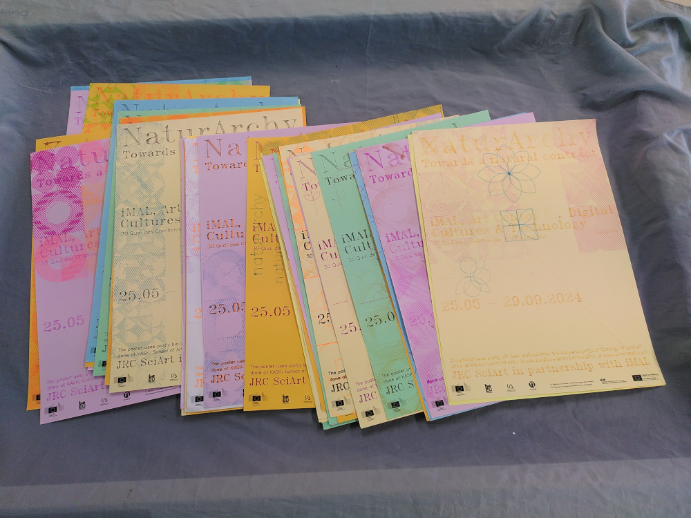
First, we had to use an inkjet printer to print all the partner’s logos at the bottom of the poster. Plotting all of these legibly would have been a real challenge. It was risky, since the outcome would have created too much change to the logos, which needed to remain intact. A big pile of coloured paper with only small logos at the bottom was then ready to be plotted. The default Clairefontaine paper is usually very popular for printing, we used this type since we had some leftover at the OSP studio.
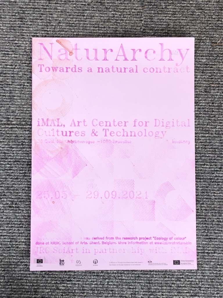
We plotted from 10am till 10pm for three days approximately, to produce a total of 42 posters for the exhibition. Each poster is structured with informative text: the title of the exhibition, the location, the dates, a context sentence about the bio inks, and credits about the partners of the exhibition. Those rather formal assets served to structure the posters and let us play around with the background elements. No two posters are the same. Sometimes we had to readjust the pen position by hand, some pens drew clearly, and others left stains and blobs of bio ink. We composed them in the moment, laying them out on the floor in the studio to see them together, while trying out different inks and shapes. After scanning all 42 posters, they were sent to iMAL with instructions to attach them to their large glass windows near the entrance. We're most curious to see how the duration of the exhibition will change them.
The other exhibition assets
Alongside the posters, we also produced other assets for the exhibition, including designs for introduction text, exhibition title, captions for the artworks, flyers and a digital kit of imagery to use online.
At the end of plotting process, we had some spare sheets with logos at the bottom. We recycled them and asked iMAL to use them to display the introduction text at the entrance of the exhibition.
As for the title of the exhibition, we mimicked the drawing process of the plotter. Usually, vinyl is applied to the glass outside of iMAL for exhibition titles, as it is a weather-resistant material. However, we decided to not use vinyl, opting instead for water-based paint. We printed the text that would be displayed on A3 sheets, which were then stuck together, one for each glass panel. These were then placed on the glass inside iMAL, and the lines of the Hershey fonts were traced by hand on the glass outside of the space. When it rains (as it often does in Brussels), the paint may wear. It can then be traced again as long as the exhibition is on display.
The captions of the artworks have been laser engraved directly at iMAL since they have a wood workshop and a laser cutting machine. With the gesture being similar to the pen plotter (sending a file to a machine that draws), it was an efficient reference of our initial process.
We were asked to deliver 2000 flyers to promote the exhibition. As this volume was unreasonable to produce with the pen plotter, we printed them using the Risograph technique at R·DRYER STUDIO. This seemed a good alternative, since Risograph has a crafty and “imperfect” aspect and also is more ecologically sound than an offset or digital commercial printing process. We could produce the flyers locally in Brussels, in dialogue with the printer. The process felt also similar to the posters since each layer of the flyer was printed with ink in different colours.
Finally, we delivered a “digital kit” which consisted of scans of selected posters, that had different levels of legibility. We selected them from a range of very legible posters to more experimental and stained versions. Each poster could be cropped as a square or a rectangle, for different social media purposes. The scanned posters have a particular materiality which felt interesting to see on the usually sleek and perfect screen.
2024-06-04 14:03:00
Introduction
OSP were commissioned by iMAL to design a graphic identity for the exhibition NaturArchy: Towards a Natural Contract, taking place in Brussels, from the 25.05 till 29.09.2024.
As the exhibition is comprised of art/science collaborations on the theme of nature, we began with an intention to experiment with pen plotters and bio inks. The bio inks were previously used in a 2018 collaboration between OSP and María Boto Ordonez, a scientist working at the Laboratorium.
Pen plotters
A pen plotter is a machine that draws. Or rather, a machine that takes instructions to plot coordinates on the x- and y- axes with a pen, while it is up or down. These machines pre-date the modern office printer as a way to output vector graphics on paper.
Using a pen plotter is a slow, musical process. We found the "songs" it made came from the shapes it was drawing - the pitch depending on the angle of the line. A plotted circle (which is in reality not a continuous curve, but rather a series of small increments of points) produced a musical run through a wide range of notes. Often we could know which drawing it was making by the song it was playing. Drawing the same shape (for example a flower) in two different sizes, would create the same melody but at a different speed, the small flower playing at a higher tempo.
Pen plotters speak a language called HPGL (Hewlett Packard Graphics Language), which has a relatively simple syntax. HPGL uses commands such as SP (Select Pen), PU (Pen Up), PD (Pen Down), PA (Plot Absolute), PR (Plot Relative) and LT (Line Type). For very expanded documentation, the Isoplotec website is a good resource.
There is quite a collection of pen plotters available to use within the newly-created plotter station at OSP. The machine that we used was a Roland DXY-1100. It holds A3 sheets of paper electrostatically in place for a pen to move over it. After the machine is initialised, the plotter picks up a pen from one of eight slots in the carousel. The thickness of the lines it will draw depends on the type of pen, and specifically the width of its nib. We used both commercially manufactured Stabilo brand pens for synthetic ink and refillable pens to hold the bio inks. As the pens we were using were not manufactured specifically for pen plotters, we had to fit a 3D-printed adaptor that the machine would be able to hold. Several methods for making fine adjustments in the vertical alignment have been improvised by other pen plotter enthusiasts, such as the students of XPUB (Experimental Publishing) Master at the Piet Zwart Institute in Rotterdam. We did not have such a vertical alignment tool, but instead improvised with masking tape, trial and error.
It’s hard to seek total control and perfection with the pen plotter: sometimes it’s not grabbing the pen, it’s pushing too hard, sometimes the bio inks are too dry leaving no mark, or too inky creating liquid stains. It is this uncertainty we cherished but which also required us to stay next to the machine all the time, either fixing the mistakes by hand, or embracing them and watching them happen, mesmerised. After some time, the pen plotter felt like a companion or a pet, that we had to feed and take care of. It had its own personality, being always surprising and nonlinear. We caught ourselves several times silently smiling and observing its every move, rocked by its melody. Like a proud parent, our phones were full of videos of its actions.
Bio inks
The bio inks we used for this project are created by María at the Laboratorium, a biolab located within the Media Arts Studio at the Royal Academy of Fine Arts (KASK) in Ghent. They are made with natural pigments and algaes, and they naturally disappear when placed in direct exposure to sunlight. We decided to work with this ephemerality, imagining having posters with some details almost completely faded out by the end of the exhibition.
Before visiting María’s biolab, we made some experiments by plotting with “natural” inks we made from materials we found at the OSP studio: soy sauce, turmeric and coffee. The result was exciting but very pale and only brownish in hue. The aspect of these inks when used on paper is very close to watercolour, it’s very pale, fluid and had a fragile feel.
At her biolab in Ghent, María generously gave us some new bio inks: a very bright pink, a deep blue, an orange and a green, which were much more interesting to work with. Because María is working more with structured color these days than with bio inks, she still had some reserves left over.
Some inks worked great and without needing close assistance, for example the pink was very fluid but dense and the result was very bright. In contrast, the green was hard to mix and was very pale, almost invisible. The timeframe for this project was super short, so we didn't have much time to experiment. With more time we'd like to dig a bit deeper into different fluids to mix the pigments with (such as alcohol, or oil).
The poster series
Our initial research involved trying out making patterns that used the shapes of iMAL's identity (circle, square, triangle, diamond). These shapes provided a basic starting point from which to understand HPGL. To draw a line, the pen plotter needs instructions where to take the raised pen to. These come in the form of a direction to move the raised pen to a set of coordinates. Then a direction to put the pen down and move it to another set of coordinates. In this way, the machine uses HPGL to draw the outlines of shapes, and crosshatch fills for them.
We generated patterns in HPGL using a python script. These created a series of moiré effects that we could directly send to the pen plotter. We tried also with a stereotypical flower drawing, using only basic curves, and other typographic experiments. The fonts we used come from the Hershey typeface. These were generated from an extension of the software Inkscape. We chose to use Hershey fonts as they are monoline fonts, meaning that they are composed from lines. This makes them therefore suitable for a pen plotter, which draws lines but not fills.
First, we had to use an inkjet printer to print all the partner’s logos at the bottom of the poster. Plotting all of these legibly would have been a real challenge. It was risky, since the outcome would have created too much change to the logos, which needed to remain intact. A big pile of coloured paper with only small logos at the bottom was then ready to be plotted. The default Clairefontaine paper is usually very popular for printing, we used this type since we had some leftover at the OSP studio.
We plotted from 10am till 10pm for three days approximately, to produce a total of 42 posters for the exhibition. Each poster is structured with informative text: the title of the exhibition, the location, the dates, a context sentence about the bio inks, and credits about the partners of the exhibition. Those rather formal assets served to structure the posters and let us play around with the background elements. No two posters are the same. Sometimes we had to readjust the pen position by hand, some pens drew clearly, and others left stains and blobs of bio ink. We composed them in the moment, laying them out on the floor in the studio to see them together, while trying out different inks and shapes. After scanning all 42 posters, they were sent to iMAL with instructions to attach them to their large glass windows near the entrance. We're most curious to see how the duration of the exhibition will change them.
The other exhibition assets
Alongside the posters, we also produced other assets for the exhibition, including designs for introduction text, exhibition title, captions for the artworks, flyers and a digital kit of imagery to use online.
At the end of plotting process, we had some spare sheets with logos at the bottom. We recycled them and asked iMAL to use them to display the introduction text at the entrance of the exhibition.
As for the title of the exhibition, we mimicked the drawing process of the plotter. Usually, vinyl is applied to the glass outside of iMAL for exhibition titles, as it is a weather-resistant material. However, we decided to not use vinyl, opting instead for water-based paint. We printed the text that would be displayed on A3 sheets, which were then stuck together, one for each glass panel. These were then placed on the glass inside iMAL, and the lines of the Hershey fonts were traced by hand on the glass outside of the space. When it rains (as it often does in Brussels), the paint may wear. It can then be traced again as long as the exhibition is on display.
The captions of the artworks have been laser engraved directly at iMAL since they have a wood workshop and a laser cutting machine. With the gesture being similar to the pen plotter (sending a file to a machine that draws), it was an efficient reference of our initial process.
We were asked to deliver 2000 flyers to promote the exhibition. As this volume was unreasonable to produce with the pen plotter, we printed them using the Risograph technique at R·DRYER STUDIO. This seemed a good alternative, since Risograph has a crafty and “imperfect” aspect and also is more ecologically sound than an offset or digital commercial printing process. We could produce the flyers locally in Brussels, in dialogue with the printer. The process felt also similar to the posters since each layer of the flyer was printed with ink in different colours.
Finally, we delivered a “digital kit” which consisted of scans of selected posters, that had different levels of legibility. We selected them from a range of very legible posters to more experimental and stained versions. Each poster could be cropped as a square or a rectangle, for different social media purposes. The scanned posters have a particular materiality which felt interesting to see on the usually sleek and perfect screen.
2023-10-20 22:00:00
OSP responds to the Call for action for artistic and cultural organisations and institutions
As cultural workers committed to opposing all forms of racism and colonial violence,
we strongly and unambiguously support the Palestinian population in their struggle for freedom.
The call asks for symbolic and tangible actions that we are and will be undertaking in solidarity with the Palestinian people in this time of genocide.
As designers we have no audience per say but a network of collaborators and platforms accumulated over years of common projects.
We believe that those platforms and communities can be political tools.
We contacted our collaborators and relayed this call to such platforms with an intention of mutual responsabilisation as an action of support.
We invite the groups for which we build design to use their platforms according to this call.
We hope that it can help opening up spaces for: spreading information, dissusions and symbolic or material actions within the Brussels cultural sector.
We invite other design studio to do the same, and think about their position as builders of identities and visibility in time where unambiguous political positionning can impact the public opinion and the position and action of states.
OSP endorses the BDS movement as formulated by BACBI
In addition to the important links shared in in the call, we add:
This declaration was inspired by one from Varia and others.
2023-07-14 15:00:00
In 2013, in the middle of W3C discussion threads around Paged Media features of the web, browsers engine shifts and partially implemented CSS standards, OSP started to use HTML and CSS to make books and publications.
While figuring out what impact it would have on their practice to make printed matter with web technologies, OSP listed their issues to solve. At the top of this list we find the issue of flowing text on a page. Which is marked as resolved with an "ok", thanks to the presence of a specific CSS property: CSS Regions.

Slide made for a lightning talk during the 2013 edition of the LGM (Libre Graphics Meeting) in Madrid, found in the Balsamine 2013-2014 repository: https://gitlab.constantvzw.org/osp/work.balsamine.2013-2014/-/blob/68417b61b23a73a9c6807d6265d4385964bad195/lgm-talk/
The Mmmmmm at the right bottom of the slide might already indicate a gut feeling and awareness of the always-changing dynamics of the web. In the same year, in 2013, Chromium announced that they will switch browser engine, from WebKit to Blink, and that they will drop the support of CSS Regions. Since then, it has become increasingly hard to still use CSS Regions on Linux machines. But not impossible.
The story around OSP's work with CSS Regions introduces a particular example of a dependency relation that is entangled with a complex configuration of software timelines, web standards, layout traditions, commissioned work and excitement to explore book making with HTML and CSS.
Why did OSP choose to stay with a never fully implemented CSS standard?
Why are the CSS Regions important for OSP?
Which workarounds are needed to keep working with CSS Regions today?

{ OSP CSS Regions W3C } -> { OSP -> CSS Regions -> W3C } [label=" ? "]
Alex Leray, Amélie Dumont, Gijs de Heij and Doriane Timmermans (OSP) in conversation with Simon Browne and Manetta Berends (Varia) at the OSP studio, in the late afternoon of Wednesday the 7th of September 2022.
Initially broadcasted in the context of the Publishing Partyline, a two day event in October 2022. The full conversation can be accessed and listened to here: https://cc.vvvvvvaria.org/wiki/Standards_and_work_arounds
Manetta: Can you maybe explain what CSS Regions are and how it works?
Doriane: Yeah. [laughter] So CSS Regions is mainly a set of CSS
properties. And the way it works, is that's it separates a bit the
content from the layout, in the sense that you still have all your
's and paragraphs in one content
, but then you're able to
let all your content flow in another set of
's. Which are
basically kind of empty
's, because when you inspect them there
is not the real content in them, but the browser renders it as such that
the text is inside of it.
So what it allows you to do is that you have one big flow of content,
and to divide it into seperate content flows, and to place each of these
flows into a different
. So it's helpful to make magazine layouts
and printed media in general.

How you work with CSS Regions in HTML and CSS: you copy your content in the
element, which is flowed into the
.
Manetta: Why was it important to use CSS Regions in your work?
Alex: I think the first reason was to do a multi-paged document.
Because if you have a printed booklet, it might be as simple as you
want, like one column of text. But you might have a footer, or you might
have an image on the right page, and then you want to continue the text
on the page after. So at some point it was kind of the solution to that,
within this kind of broken environment of web-to-print at the time. So
it was not so much... because then it's funny to say where the CSS
Regions came in, but was not so much about... It was a little bit like
problem solving for this multi-paged output. That's the way that we
found to do more fragmented layouts, and also to go away a bit from the
linearity from the web. But it also was at some costs in a way.
Manetta: We'll get to the costs in a bit. [laughter]
Because in 2013 the CSS Regions functionality was removed from the browser you are using in your practice, which is Chromium, a version of Chrome that is part of the Linux operating system that you are running on your computers.
It would be great to dive into this moment together and speak about what happened and why.
This is going to be a bit of a technical part of the story, to which you are much more closer to, so please feel free to interrupt...
Simon: Yes please correct our research. [laughter]
Manetta: So in 2013 Google made a big change to Chrome and Chromium: they switched to a different browser engine. Google forked Apple's browser engine WebKit and started Blink, a new browser engine. And as part of this change, they also decided to remove the support for CSS Regions from Blink.
Maybe we should start with explaining what a browser engine is, before we continue? Because that is quite important.
Gijs: So a browser engine is a piece of software that translates the
code of a web page into pixels, or the code into an image. So it
combines the content together with the rules for the layout and the
constraints that are there, for example the width of your browser
window, and then calculates or determines what the layout should be.
Maybe a clear example is to think about an image with a width of 50% and a text flowing next to it.
If your screen is very wide, the image will become bigger, but also more text fits next to it.
So that needs to be calculated. And if your screen is smaller, then the image is
smaller as well and the text has to flow differently.
So that's what this engine does. It takes the instructions or the limitations set in CSS and
combines it with the content that it finds in the HTML, and it
determines what is looks like on your screen.

A browser engine renders the HTML + CSS into a web page, taking the size and resolution of your screen into account.
Manetta: And you could work with CSS Regions because they were implemented in the WebKit browser engine, right? Can you say a bit more about WebKit? What made you aware that you were reyling on this particular browser engine?
Gijs: Well WebKit is a fork of KHTML. Apple introduced its own
browser as a competition with I think Firefox. And at that moment also
Internet Explorer was also still working on Mac. So Apple took an existing
open source project, KHTML, and brought other engineers into the project and turned it into WebKit eventually.
So they took over the project in a way. And because WebKit was an open source project,
it was also implemented in other browsers that you could use on Linux.
Manetta: What happened when Chrome switched from using WebKit to Blink?
Gijs: I don't know exactly, but...
Alex: First Chrome was running on Blink...
Gijs: No WebKit.
Alex: On WebKit, sorry. And they were sharing the same web rendering...
Gijs: Engine.
Alex: ...engine –thank you– with Safari basically. And Chrome took
some shares on the market. At some point they decided that they wanted
to continue the development of the browser, they probably disagreed with
something, I don't know the story, but I think there was some kind of
disagreement.
Gijs: I think, in my mind, CSS Regions was the reason for the split.
In the sense that there were blog posts about the enormity of... Let's
say, there were a lot of lines of code that were there specifically to
support CSS Regions. And the developers wanted to decrease the size of Blink.
And also, which is something else, CSS Regions has been proposed as a standard by Adobe.
It very closely imitates the idea that Adobe has about layout, where you draw boxes on a page and there's content
flowing into the boxes. Very much like how their tool InDesign works.
And there's also kind of a clear relationship between Adobe and Apple. As
in, I think at that moment, the most important reason for people to use
Apple computers was because Adobe software was running on it. So I also think
that that heavily influenced Adobe's proposal and their interest in the
WebKit project.
And Google wanted to remove CSS Regions, or at least that is my understanding of the story.
They wanted to remove the CSS Regions functionality, because it would make the browser faster.
Manetta: Yes that is what we also read. That CSS Regions occupied
10.000 lines of code, which could be removed from the browser engine
basically, which was written in 350.0000 lines of C++ code in total.
Manetta: Did you heavily rely on Chrome in your practice actually?
Alex: I think when we discovered CSS Regions, I think we used
Chromium. Which is an open source... it is a version of the Chrome browser on Linux.
But we used it only for a very brief time, if I remember it correctly, because right after Chrome and thus also Chromium
decided to remove the CSS Regions functionality.
Gijs: Safari does not run on Linux. So at that moment Chromium was the
biggest browser on the Linux platform that used the WebKit rendering engine.
Manetta: Just to clarify, you all the using Linux in your practice? That is an important detail.
Together: Yes.
Manetta: So the browser you were using to produce your work in, stopped supporting the CSS Regions.
Alex: Exactly.
Manetta: Which meant that the way in which you were producing layouts with HTML and CSS was not working anymore, thanks to switch of Chrome from WebKit to Blink in 2013. That must have been quite scary. How did you respond to it?
Alex: I think we, we tried..., I mean... we started a bit panicking
I think. Not because we liked so much this CSS Regions functionality,
because like I said, it was our only way at the time, or the only way
how you could think about multi-page layout in the web browser. And we
were not so much enthusiastic to come back to the former tools, such as Scribus.
We liked working with the web so much that we wanted to continue like that, even though we had some
reservations about CSS Regions itself.

Chrome switching its browser engine in 2013 caused a bit of panick, as other WebKit-based browsers did not fulfill the needs of OSP, or could not be used on a Linux machine which was the case for Safari.
Alex: What we tried was to use a polyfill, that was developed by a student at
Adobe, actually, to circumvent or to re-implement in a way this idea of
CSS Regions.
What we found was that it was very nice to have this code
around, but it was also very difficult to work with the Javascript
implementations of it. Because first of all, it was written in Javascript which is not a low level programming
language and it made it very very slow when working on large documents. And second, it
was breaking some nice CSS features, like selectors, which you use for
instance if you want to select the first paragraph of your document.
And when using the polyfill, it will suddenly select the first paragraph of every
page, because the content is literally broken into chunks.
Manetta: Can you say maybe more about this notion of a "polyfill"?
Alex: I think the name comes from polyfilla. The thing you put in
the wall, no?
Simon: Oh like when you get a crack in the wall? Polyfill, yes, it's
a brand. Yes it's a brand for fixing cracks in the wall.
Alex: So it's exactly that, this idea to fix cracks in the wall.
Simon: Never thought about that.
Alex: Yes the idea is that, correct me if I'm wrong but, so
like... you write your code as if you were using natively the
functionality, but in the background there is some Javascript or a set
of assets, that kind of turn it into a compatible mode for you.

Chrome stopped supporting CSS Regions, but with the use of a polyfill made by a student at Adobe, the CSS Regions could be used again.
Manetta: And this brought the CSS Regions back?
Alex: Briefly, but then, like I said, there was this speed issue. It
was really a mess to layout the magazine we were working on, Médor, with this polyfill.
It was really really slow. It was kind of breaking this interactivity we had with the
browser.
Doriane: And also, there is an important difference with the
polyfill. It tries to replace the way how CSS Regions work, but in doing
so it totally changes the way that CSS Regions are working. Because CSS
Regions is this kind of illusion, that is rendering content like it was
inside the document. And the polyfill is actually breaking up the
content and actually putting it into the
. So there is this
confusion where you can see how CSS Regions was removed, because it was
confusing how you could target a specific element. Because for example,
if you wanted to target the first element of the column, there is no
first element of this column, because it is just rendered as an illusion
through the property of the CSS Regions.
But also, if you use the polyfill, then you can actually do this,
because the paragraph becomes the first element of the column. But you
cannot do the old approach, which is the native approach of CSS Regions,
which is for example able to select the 5th paragraph of my text.
I think this is an interesting approach. This is also one of the expressed
arguments why CSS Regions was removed. But at the same time, in Médor
when we started to use the polyfill, the polyfill was not right,
because we were used to the reason why it was removed.
[laughter]
Manetta: Did you work with the polyfill for a while, or what happened?
Alex: In my case for a couple of weeks. And then I gave up and we
tried to look for other WebKit engines, because actually there were
some. I remember using another browser for a while: Epiphany.
Manetta: Which also uses WebKit?
Alex: Yes at least at that time it was using WebKit.
And there were some others.
But the problem was that the projects were not so active.
And sometimes they lack very much on the trunk of the WebKit engine.
Gijs: Yes so there's the difference between the browser and the
engine, the browser being the interface and the engine translating the
instructions. Just to explain what you said about the trunk and lagging
behind.
So what it means to lag behind, is that you work with an old version of the
engine. Meanwhile time goes on and new exciting CSS properties emerge, that you cannot
use, because the engine is too old, in the sense that it is not updated.
So when an engine is lagging behind for a year, you can bump into unexpected surprises,
which force you to think why some specific CSS properties are suddenly not working.

From WebKit to OSPKit!
Manetta: In the end you forked a browser engine yourself, right?
Alex: Not a browser engine, but... So actually when we did this
review of all the browsers using the WebKit engine, at some
point we found one, but it was not a browser. It was a wrapper
around the WebKit engine, that allowed you to insert a kind of widget
into your program, with a web view.
The project we found is called Qt-WebKit. And at
some point we got enthusiastic about it and started to make a "web browser" –I'm
using quotes because it's a very very minimal one. It is basically a software
that has a big web view and a small URL bar. And you click OK and then you can
see the page inside the web view. And that is what we called OSPKit, which is part of our html2print workflows.
Manetta: And because OSPKit is based on WebKit, it brought the CSS Regions back?
Alex: Yes. And the developer of Qt-WebKit was still trying to keep the thing
updated. And it also was someone who we could reach on IRC and discuss
with. I remember once I asked him if there was a specific property
available in the browser, and he said no. And 3 minutes later he
implemented it for me. So it was a very nice experience, to be so close
to the developer and his project.
Manetta: And why was it important to keep working with CSS Regions?
Gijs: So we had developed more and more projects around using CSS Regions,
or that were depending on CSS Regions.
Manetta: One of the recurrent projects in which you worked with CSS Regions was Médor, right?
Amélie: Yes so Médor is a Belgian magazine, that is about... I'm
not sure how to say it in English. It's journalism and a news magazine,
doing deep investigation. There is an issue every three months and it
has been laid out with html2print since the beginning.
Manetta: So it was an important project for which you needed OSPKit?
Alex: Yes. I think the first issue was in 2015, so it was really at
the time when we were very active about building our toolset.
The Médor project both benefited from our research and also was a drive to conduct
more research. And because it was ambitious, not in the sense of
aesthetics or whatever –it was that as well I hope– but it was
ambitious in the sense that the magazine was broadly distributed and reaching a lot of people.
So there was a lot of pressure to make sure that we have a correct PDF at the printer in
time. Because in journalism the release is a very important milestone
that you cannot really miss.
Manetta: Do you want to say more about that question why it was then
important to develop OSPKit?
Gijs: If we hadn't done that it wouldn't have been possible to
continue working with our workflow. It would have fallen apart and we would
have had to rethink completely how we would make the layout for Médor.
The layout of Médor is very much based on a grid, using all the boxes and all the space that
is available on the page. And without CSS Regions it would not have been possible to produce such layout at that
moment. We would have only been able to work with a single flow. You can maybe float elements to the
left and right, but that is it. State of the art at that moment were multi-column layouts, and this was often not
supported in html2print. Which means that you're left with a very impoverished experience.
And there's also something about... it being possible. Like you're also
maybe clinging on to the possibilities of the moment. In the sense that... I think
it's important to mention that there is this promise of open source,
that you are able to influence or control your tool. But here it became
very clear that a browser engine is such a complex piece of software, and so
many people are working on it, and if those people decide to take a
different direction, that they don't care about the things that you care
about, for whatever reason. This might feel very foreign or might
also feel wrong. But it sort of leaves you in the dark. You're there, and
the browser caravan is carrying on, following their own path. And you try everything you can to keep
on working with it, as long as you can. Also from the hope that, you know...
that in WebKit, the CSS Regions remain supported.
Manetta: So did the maintainance work of OSPKit become part of your practice? Next to producing the layout for the magazine, or other projects that you were working on, you also needed to maintain a browser.
I'm curious to understand the impact of such workarounds on a design practice like yours.
Because in the end OSPKit is a workaround, no? A work around the main direction of the development of the web.
A work around the decisions that the makers of browsers make.
What happens when you introduce such workarounds into a design practice? Because it is quite something. Can we unpack that?
Doriane: Yes, maybe. One of the things is that it creates a bit of
an alternate reality. Because you're suddenly living in your own browser.
The path is split in two. And the current status of web-to-print goes
further and new things are happening there. But in the world of this
OSPKit browser, things are a bit stuck in time. And okey you have
this work around that allows you to use a magic property that you want
to keep close to yourself. But then you have to live in your own
reality, that is a bit outside of the evolution and the tendency of the
rest of the designer practice in web-to-print specifically.
Alex: Yes exactly... Because now OSPKit is kind of fixed in time, and
it's already static since 2016 or something. It's getting very old, especially
in this world.
[laughter]

The versions of HTML, CSS and Javascript that can be used in OSPKit are stuck in 2016.
Alex: It was a way to keep a feature feature alive, a very nice feature,
or at least a work around that allowed us to stay with our practice.
But at the same time it's also, like you said, it is cutting us
from new practices that could arise, with new web CSS properties and
developments of the web. So yes, it's a bit, I don't know how to say it,
but it's doing good and bad at the same time.
Amélie: Just a few hours before the interview we were chatting
and Gijs used the word technological archeology, and I think it fits
to the way I feel as I'm coming back on Médor and I didn't especially
follow the development of html2print. Yes that's it. I'm using that
tool, that's using old technologies, and we cannot use more recent CSS
properties. And so yes, we have to work in other ways and find other
ways of doing.
Sometimes I'm trying to do something, and then I realise, oh I cannot use the
recent CSS, so let's try to find another way to do it otherwise. It's
another mindset.
Doriane: Yeah and it's a weird feeling. Like when you're used to
moments when you think, oh I don't know how to do this thing, then
you're looking at the docs online, and then you're doing it. And of
course it's working, because you copy paste the example from the doc. But
then you cannot just look at the doc, you need to test everything and if
something is not working you're not sure what exactly is working and what not.
I remember that especially when working with Javascript, realising that
yes, we're stuck with using a version of Javascript of 2016, which
has evolved a lot since. And it's also different to work with HTML and
CSS from 2016.
For example, when you want to make a border around a
font, and the border does not show, you know that this CSS property was
not supported in 2016. But if you're writing Javascript it becomes super hard to
debug, because you have no idea which line is supported and which one not.
2023-07-14 15:00:00
In 2013, in the middle of W3C discussion threads around Paged Media features of the web, browsers engine shifts and partially implemented CSS standards, OSP started to use HTML and CSS to make books and publications.
While figuring out what impact it would have on their practice to make printed matter with web technologies, OSP listed their issues to solve. At the top of this list we find the issue of flowing text on a page. Which is marked as resolved with an "ok", thanks to the presence of a specific CSS property: CSS Regions.
Slide made for a lightning talk during the 2013 edition of the LGM (Libre Graphics Meeting) in Madrid, found in the Balsamine 2013-2014 repository: https://gitlab.constantvzw.org/osp/work.balsamine.2013-2014/-/blob/68417b61b23a73a9c6807d6265d4385964bad195/lgm-talk/
The Mmmmmm at the right bottom of the slide might already indicate a gut feeling and awareness of the always-changing dynamics of the web. In the same year, in 2013, Chromium announced that they will switch browser engine, from WebKit to Blink, and that they will drop the support of CSS Regions. Since then, it has become increasingly hard to still use CSS Regions on Linux machines. But not impossible.
The story around OSP's work with CSS Regions introduces a particular example of a dependency relation that is entangled with a complex configuration of software timelines, web standards, layout traditions, commissioned work and excitement to explore book making with HTML and CSS.
Why did OSP choose to stay with a never fully implemented CSS standard?
Why are the CSS Regions important for OSP?
Which workarounds are needed to keep working with CSS Regions today?
{ OSP CSS Regions W3C } -> { OSP -> CSS Regions -> W3C } [label=" ? "]
Alex Leray, Amélie Dumont, Gijs de Heij and Doriane Timmermans (OSP) in conversation with Simon Browne and Manetta Berends (Varia) at the OSP studio, in the late afternoon of Wednesday the 7th of September 2022.
Initially broadcasted in the context of the Publishing Partyline, a two day event in October 2022. The full conversation can be accessed and listened to here: https://cc.vvvvvvaria.org/wiki/Standards_and_work_arounds
Manetta: Can you maybe explain what CSS Regions are and how it works?
Doriane: Yeah. [laughter] So CSS Regions is mainly a set of CSS
properties. And the way it works, is that's it separates a bit the
content from the layout, in the sense that you still have all your
's and paragraphs in one content
, but then you're able to
let all your content flow in another set of
's. Which are
basically kind of empty
's, because when you inspect them there
is not the real content in them, but the browser renders it as such that
the text is inside of it.
So what it allows you to do is that you have one big flow of content,
and to divide it into seperate content flows, and to place each of these
flows into a different
. So it's helpful to make magazine layouts
and printed media in general.
How you work with CSS Regions in HTML and CSS: you copy your content in the
element, which is flowed into the
.
Manetta: Why was it important to use CSS Regions in your work?
Alex: I think the first reason was to do a multi-paged document.
Because if you have a printed booklet, it might be as simple as you
want, like one column of text. But you might have a footer, or you might
have an image on the right page, and then you want to continue the text
on the page after. So at some point it was kind of the solution to that,
within this kind of broken environment of web-to-print at the time. So
it was not so much... because then it's funny to say where the CSS
Regions came in, but was not so much about... It was a little bit like
problem solving for this multi-paged output. That's the way that we
found to do more fragmented layouts, and also to go away a bit from the
linearity from the web. But it also was at some costs in a way.
Manetta: We'll get to the costs in a bit. [laughter]
Because in 2013 the CSS Regions functionality was removed from the browser you are using in your practice, which is Chromium, a version of Chrome that is part of the Linux operating system that you are running on your computers.
It would be great to dive into this moment together and speak about what happened and why.
This is going to be a bit of a technical part of the story, to which you are much more closer to, so please feel free to interrupt...
Simon: Yes please correct our research. [laughter]
Manetta: So in 2013 Google made a big change to Chrome and Chromium: they switched to a different browser engine. Google forked Apple's browser engine WebKit and started Blink, a new browser engine. And as part of this change, they also decided to remove the support for CSS Regions from Blink.
Maybe we should start with explaining what a browser engine is, before we continue? Because that is quite important.
Gijs: So a browser engine is a piece of software that translates the
code of a web page into pixels, or the code into an image. So it
combines the content together with the rules for the layout and the
constraints that are there, for example the width of your browser
window, and then calculates or determines what the layout should be.
Maybe a clear example is to think about an image with a width of 50% and a text flowing next to it.
If your screen is very wide, the image will become bigger, but also more text fits next to it.
So that needs to be calculated. And if your screen is smaller, then the image is
smaller as well and the text has to flow differently.
So that's what this engine does. It takes the instructions or the limitations set in CSS and
combines it with the content that it finds in the HTML, and it
determines what is looks like on your screen.
A browser engine renders the HTML + CSS into a web page, taking the size and resolution of your screen into account.
Manetta: And you could work with CSS Regions because they were implemented in the WebKit browser engine, right? Can you say a bit more about WebKit? What made you aware that you were reyling on this particular browser engine?
Gijs: Well WebKit is a fork of KHTML. Apple introduced its own
browser as a competition with I think Firefox. And at that moment also
Internet Explorer was also still working on Mac. So Apple took an existing
open source project, KHTML, and brought other engineers into the project and turned it into WebKit eventually.
So they took over the project in a way. And because WebKit was an open source project,
it was also implemented in other browsers that you could use on Linux.
Manetta: What happened when Chrome switched from using WebKit to Blink?
Gijs: I don't know exactly, but...
Alex: First Chrome was running on Blink...
Gijs: No WebKit.
Alex: On WebKit, sorry. And they were sharing the same web rendering...
Gijs: Engine.
Alex: ...engine –thank you– with Safari basically. And Chrome took
some shares on the market. At some point they decided that they wanted
to continue the development of the browser, they probably disagreed with
something, I don't know the story, but I think there was some kind of
disagreement.
Gijs: I think, in my mind, CSS Regions was the reason for the split.
In the sense that there were blog posts about the enormity of... Let's
say, there were a lot of lines of code that were there specifically to
support CSS Regions. And the developers wanted to decrease the size of Blink.
And also, which is something else, CSS Regions has been proposed as a standard by Adobe.
It very closely imitates the idea that Adobe has about layout, where you draw boxes on a page and there's content
flowing into the boxes. Very much like how their tool InDesign works.
And there's also kind of a clear relationship between Adobe and Apple. As
in, I think at that moment, the most important reason for people to use
Apple computers was because Adobe software was running on it. So I also think
that that heavily influenced Adobe's proposal and their interest in the
WebKit project.
And Google wanted to remove CSS Regions, or at least that is my understanding of the story.
They wanted to remove the CSS Regions functionality, because it would make the browser faster.
Manetta: Yes that is what we also read. That CSS Regions occupied
10.000 lines of code, which could be removed from the browser engine
basically, which was written in 350.0000 lines of C++ code in total.
Manetta: Did you heavily rely on Chrome in your practice actually?
Alex: I think when we discovered CSS Regions, I think we used
Chromium. Which is an open source... it is a version of the Chrome browser on Linux.
But we used it only for a very brief time, if I remember it correctly, because right after Chrome and thus also Chromium
decided to remove the CSS Regions functionality.
Gijs: Safari does not run on Linux. So at that moment Chromium was the
biggest browser on the Linux platform that used the WebKit rendering engine.
Manetta: Just to clarify, you all the using Linux in your practice? That is an important detail.
Together: Yes.
Manetta: So the browser you were using to produce your work in, stopped supporting the CSS Regions.
Alex: Exactly.
Manetta: Which meant that the way in which you were producing layouts with HTML and CSS was not working anymore, thanks to switch of Chrome from WebKit to Blink in 2013. That must have been quite scary. How did you respond to it?
Alex: I think we, we tried..., I mean... we started a bit panicking
I think. Not because we liked so much this CSS Regions functionality,
because like I said, it was our only way at the time, or the only way
how you could think about multi-page layout in the web browser. And we
were not so much enthusiastic to come back to the former tools, such as Scribus.
We liked working with the web so much that we wanted to continue like that, even though we had some
reservations about CSS Regions itself.
Chrome switching its browser engine in 2013 caused a bit of panick, as other WebKit-based browsers did not fulfill the needs of OSP, or could not be used on a Linux machine which was the case for Safari.
Alex: What we tried was to use a polyfill, that was developed by a student at
Adobe, actually, to circumvent or to re-implement in a way this idea of
CSS Regions.
What we found was that it was very nice to have this code
around, but it was also very difficult to work with the Javascript
implementations of it. Because first of all, it was written in Javascript which is not a low level programming
language and it made it very very slow when working on large documents. And second, it
was breaking some nice CSS features, like selectors, which you use for
instance if you want to select the first paragraph of your document.
And when using the polyfill, it will suddenly select the first paragraph of every
page, because the content is literally broken into chunks.
Manetta: Can you say maybe more about this notion of a "polyfill"?
Alex: I think the name comes from polyfilla. The thing you put in
the wall, no?
Simon: Oh like when you get a crack in the wall? Polyfill, yes, it's
a brand. Yes it's a brand for fixing cracks in the wall.
Alex: So it's exactly that, this idea to fix cracks in the wall.
Simon: Never thought about that.
Alex: Yes the idea is that, correct me if I'm wrong but, so
like... you write your code as if you were using natively the
functionality, but in the background there is some Javascript or a set
of assets, that kind of turn it into a compatible mode for you.
Chrome stopped supporting CSS Regions, but with the use of a polyfill made by a student at Adobe, the CSS Regions could be used again.
Manetta: And this brought the CSS Regions back?
Alex: Briefly, but then, like I said, there was this speed issue. It
was really a mess to layout the magazine we were working on, Médor, with this polyfill.
It was really really slow. It was kind of breaking this interactivity we had with the
browser.
Doriane: And also, there is an important difference with the
polyfill. It tries to replace the way how CSS Regions work, but in doing
so it totally changes the way that CSS Regions are working. Because CSS
Regions is this kind of illusion, that is rendering content like it was
inside the document. And the polyfill is actually breaking up the
content and actually putting it into the
. So there is this
confusion where you can see how CSS Regions was removed, because it was
confusing how you could target a specific element. Because for example,
if you wanted to target the first element of the column, there is no
first element of this column, because it is just rendered as an illusion
through the property of the CSS Regions.
But also, if you use the polyfill, then you can actually do this,
because the paragraph becomes the first element of the column. But you
cannot do the old approach, which is the native approach of CSS Regions,
which is for example able to select the 5th paragraph of my text.
I think this is an interesting approach. This is also one of the expressed
arguments why CSS Regions was removed. But at the same time, in Médor
when we started to use the polyfill, the polyfill was not right,
because we were used to the reason why it was removed.
[laughter]
Manetta: Did you work with the polyfill for a while, or what happened?
Alex: In my case for a couple of weeks. And then I gave up and we
tried to look for other WebKit engines, because actually there were
some. I remember using another browser for a while: Epiphany.
Manetta: Which also uses WebKit?
Alex: Yes at least at that time it was using WebKit.
And there were some others.
But the problem was that the projects were not so active.
And sometimes they lack very much on the trunk of the WebKit engine.
Gijs: Yes so there's the difference between the browser and the
engine, the browser being the interface and the engine translating the
instructions. Just to explain what you said about the trunk and lagging
behind.
So what it means to lag behind, is that you work with an old version of the
engine. Meanwhile time goes on and new exciting CSS properties emerge, that you cannot
use, because the engine is too old, in the sense that it is not updated.
So when an engine is lagging behind for a year, you can bump into unexpected surprises,
which force you to think why some specific CSS properties are suddenly not working.
From WebKit to OSPKit!
Manetta: In the end you forked a browser engine yourself, right?
Alex: Not a browser engine, but... So actually when we did this
review of all the browsers using the WebKit engine, at some
point we found one, but it was not a browser. It was a wrapper
around the WebKit engine, that allowed you to insert a kind of widget
into your program, with a web view.
The project we found is called Qt-WebKit. And at
some point we got enthusiastic about it and started to make a "web browser" –I'm
using quotes because it's a very very minimal one. It is basically a software
that has a big web view and a small URL bar. And you click OK and then you can
see the page inside the web view. And that is what we called OSPKit, which is part of our html2print workflows.
Manetta: And because OSPKit is based on WebKit, it brought the CSS Regions back?
Alex: Yes. And the developer of Qt-WebKit was still trying to keep the thing
updated. And it also was someone who we could reach on IRC and discuss
with. I remember once I asked him if there was a specific property
available in the browser, and he said no. And 3 minutes later he
implemented it for me. So it was a very nice experience, to be so close
to the developer and his project.
Manetta: And why was it important to keep working with CSS Regions?
Gijs: So we had developed more and more projects around using CSS Regions,
or that were depending on CSS Regions.
Manetta: One of the recurrent projects in which you worked with CSS Regions was Médor, right?
Amélie: Yes so Médor is a Belgian magazine, that is about... I'm
not sure how to say it in English. It's journalism and a news magazine,
doing deep investigation. There is an issue every three months and it
has been laid out with html2print since the beginning.
Manetta: So it was an important project for which you needed OSPKit?
Alex: Yes. I think the first issue was in 2015, so it was really at
the time when we were very active about building our toolset.
The Médor project both benefited from our research and also was a drive to conduct
more research. And because it was ambitious, not in the sense of
aesthetics or whatever –it was that as well I hope– but it was
ambitious in the sense that the magazine was broadly distributed and reaching a lot of people.
So there was a lot of pressure to make sure that we have a correct PDF at the printer in
time. Because in journalism the release is a very important milestone
that you cannot really miss.
Manetta: Do you want to say more about that question why it was then
important to develop OSPKit?
Gijs: If we hadn't done that it wouldn't have been possible to
continue working with our workflow. It would have fallen apart and we would
have had to rethink completely how we would make the layout for Médor.
The layout of Médor is very much based on a grid, using all the boxes and all the space that
is available on the page. And without CSS Regions it would not have been possible to produce such layout at that
moment. We would have only been able to work with a single flow. You can maybe float elements to the
left and right, but that is it. State of the art at that moment were multi-column layouts, and this was often not
supported in html2print. Which means that you're left with a very impoverished experience.
And there's also something about... it being possible. Like you're also
maybe clinging on to the possibilities of the moment. In the sense that... I think
it's important to mention that there is this promise of open source,
that you are able to influence or control your tool. But here it became
very clear that a browser engine is such a complex piece of software, and so
many people are working on it, and if those people decide to take a
different direction, that they don't care about the things that you care
about, for whatever reason. This might feel very foreign or might
also feel wrong. But it sort of leaves you in the dark. You're there, and
the browser caravan is carrying on, following their own path. And you try everything you can to keep
on working with it, as long as you can. Also from the hope that, you know...
that in WebKit, the CSS Regions remain supported.
Manetta: So did the maintainance work of OSPKit become part of your practice? Next to producing the layout for the magazine, or other projects that you were working on, you also needed to maintain a browser.
I'm curious to understand the impact of such workarounds on a design practice like yours.
Because in the end OSPKit is a workaround, no? A work around the main direction of the development of the web.
A work around the decisions that the makers of browsers make.
What happens when you introduce such workarounds into a design practice? Because it is quite something. Can we unpack that?
Doriane: Yes, maybe. One of the things is that it creates a bit of
an alternate reality. Because you're suddenly living in your own browser.
The path is split in two. And the current status of web-to-print goes
further and new things are happening there. But in the world of this
OSPKit browser, things are a bit stuck in time. And okey you have
this work around that allows you to use a magic property that you want
to keep close to yourself. But then you have to live in your own
reality, that is a bit outside of the evolution and the tendency of the
rest of the designer practice in web-to-print specifically.
Alex: Yes exactly... Because now OSPKit is kind of fixed in time, and
it's already static since 2016 or something. It's getting very old, especially
in this world.
[laughter]
The versions of HTML, CSS and Javascript that can be used in OSPKit are stuck in 2016.
Alex: It was a way to keep a feature feature alive, a very nice feature,
or at least a work around that allowed us to stay with our practice.
But at the same time it's also, like you said, it is cutting us
from new practices that could arise, with new web CSS properties and
developments of the web. So yes, it's a bit, I don't know how to say it,
but it's doing good and bad at the same time.
Amélie: Just a few hours before the interview we were chatting
and Gijs used the word technological archeology, and I think it fits
to the way I feel as I'm coming back on Médor and I didn't especially
follow the development of html2print. Yes that's it. I'm using that
tool, that's using old technologies, and we cannot use more recent CSS
properties. And so yes, we have to work in other ways and find other
ways of doing.
Sometimes I'm trying to do something, and then I realise, oh I cannot use the
recent CSS, so let's try to find another way to do it otherwise. It's
another mindset.
Doriane: Yeah and it's a weird feeling. Like when you're used to
moments when you think, oh I don't know how to do this thing, then
you're looking at the docs online, and then you're doing it. And of
course it's working, because you copy paste the example from the doc. But
then you cannot just look at the doc, you need to test everything and if
something is not working you're not sure what exactly is working and what not.
I remember that especially when working with Javascript, realising that
yes, we're stuck with using a version of Javascript of 2016, which
has evolved a lot since. And it's also different to work with HTML and
CSS from 2016.
For example, when you want to make a border around a
font, and the border does not show, you know that this CSS property was
not supported in 2016. But if you're writing Javascript it becomes super hard to
debug, because you have no idea which line is supported and which one not.
2023-06-23 14:00:00
In the middle of 10 years of web-to-print practices and on the crossing of different ways of working with HTML and CSS to make printed matter, including html2print, OSPKit, CTRL+P and Paged.js, there is a lot of material lingering around in the OSP git repositories. It's hard to find time for digestion when being in the middle of commissioned work, projects and other jobs. As satellite member and resident, we found some time for it.
Where to start if you want to explore the web-to-print practices of OSP?
We compiled an list of repositories below, annotated with notes and bits of context, to provide some handles for navigation.
As these repo's bundle a set of traces of a moment in time, you could say that these repositories are operating as boilerplates, crossing with multiple people, organisations, ideas, tools, aesthetics and timelines. The term "boilerplates" also came up during an online radio conversation hosted by Varia, in which OSP was invited to speak about their web-to-print practices. The snippets below are a selection of this conversation, focused around this term.
Alex Leray, Amélie Dumont, Gijs de Heij and Doriane Timmermans (OSP) in conversation with Simon Browne and Manetta Berends (Varia) at the OSP studio, in the late afternoon of Wednesday the 7th of September 2022.
Initially broadcasted in the context of the Publishing Partyline, a two day event in October 2022. The full conversation can be accessed and listened to here: https://cc.vvvvvvaria.org/wiki/Standards_and_work_arounds
Gijs: Html2print is a kind of a recipe or a boilerplate, which I think was initially created by Stéph [Stéphanie Vilayphiou], where you try to make a minimal version of what a book or printed publication is, using HTML and CSS and specifically CSS Regions. And possibly some Javascript to make things easier for you. For example to have not a fixed set of pages, but to use Javascript calculate how many pages you need. In the sense that this boilerplate, this HTML page, is really a document that’s filled with
’s, and these
’s have specific classes, like a page class or a crop-bar top-left, or a bleed-box. And a certain basic CSS that sets the dimensions of the page and also the dimensions of bleed-box.
But we also realized today that there are like a plethora… there are so many versions of this recipe, they’re many plugins. And we also realized that often when we do a project with html2print, we kind of copy this boilerplate and start to modify it. So in a way we all have a different version of it, it’s kind of personal. And there is also intentionally… It’s quite similar to vim, the editor, which I personally don’t use… but this idea that it’s a personal tool that you make your own, that there are plugins available and that you extend it.
What is also interesting about it is… We use git in our practice to share projects amongst each other, but also the html2print, this collection of HTML files, the actual structure of the pages with the content, is also part of the repository. So it’s like… It kind of is ingrained within the project.
Manetta: So you would say it’s difficult to see html2print without the practice, the content, the people?
Alex: Yeah for me, I think, but that’s my personal opinion, I think we have 4 different opinions around the table, but for me it has never really been a tool, a fixed or solid tool. And I think that is maybe the reason why we never managed to make a proper package of it, like as a project. And for me it’s more like a collection of practices and the tools that support these practices. The tools and all this kind of knowledge we accumulated over the years are dispersed. It’s really difficult to separate this from the projects.
Gijs: So for our own practice, I think that in a way Médor was… Or no sorry, first it was Balsamine, it started there. There was this intimate relationship with the theater or at least with the artistic directors of the theater, who gave us the space to do this experiment.
Manetta: Balsamine is the theater in Brussels here right?
Gijs: Yes and so in a way they’re part of the tool or at least they’re part of the history of the tool. And there is something about the role of the tool at Médor. Because I think all the journalists are very aware of this tool being used, and it being part of the making of the layout. There are people who use the boilerplate outside of OSP. But in a way, in our git repository, we see the projects that we have done with it. I don’t know and have personally no idea of the scope of the usage of it.
Doriane: On this idea of html2print as a tool versus html2print as an approach, I think now in the Médor context, when we think about html2print, it comes with the CSS Regions. Which we will talk about later. It is dependent on one specific browser which we had to develop to be able to use CSS Regions.
So sometimes, even though it’s more of an approach then a tool, you end up in a context we’re you’re like, okay, I want to do web-to-print, but I kind of have to choose between using this browser, which CSS Regions, or other web-to-print tools like Paged.js. Even if it’s an approach, sometimes this approach can materialize itself into a choice of tools, that are more specific and more material.
Manetta: Can we call this a boilerplate practice?
Alex: Yes, there are many boilerplates around. Like almost every project is a boilerplate. In my case I often start with finding a project that fits the new project and try to take bits here and there. And recreating and gathering all the tools I need for the new project.
I think the boilerplate that is the most complete, that combines all the features would be Médor, because in a way it’s like the most, not advanced that is not the right term… It has been going on for a long time and we had time to consolidate a lot of stuff. It involves almost all the requirements, like going to the printer, turning the PDF into CMYK. In my case it’s a bit THE boilerplate.
But at the same time, it’s also split it into different bits. Like CMYK conversion is a separate git repository, that is dedicated to taking a bunch of RGB files and having some make scripts to turn a PDF into a CMYK PDF. But even there, you have to adapt it to your project, because you have to generate the right color profiles. And you have to change the code to make to right number of pages for the booklets and so on. So it’s not something you can just take as a tool. It’s really like a boilerplate.
List of OSP WebPrint-related repositories
A repo from 2012. First attempt at making a print poster using HTML :)
Derived from Médor first issues "boilerplate".
Note: Using css regions polyfill for non-native support of css regions.
A script to fix common (French) microtypo rules: https://gitlab.constantvzw.org/osp/annak.print/-/blob/master/bin/microtypo.py
(initial repo? outdated)
Skeleton to design a webpage (for screen or print) synchronously on an etherpad.
This little tool is a boilerplate, a minimal example to start a print project using HTML, less/CSS and Javascript/Jquery to design it.
Note: not really a boilerplate anymore since it has received modifications for specific projects
There are many branches.
The branch devel seems to be the most recently updated branch.
A decent README, though probably not up-to-date.
Also contains an attempt at documention through use cases/examples.
https://gitlab.constantvzw.org/osp/tools.html2print/-/tree/merge-emile/examples
Another attempt at documenting html2print.
Great traces/glimpses of doc here by Quentin Astié!:
Empty repository! But should contain an extremly minimal "CTRL+P" only version of HTML2print
A set of filters to correct common typographical mistakes (for French Typography).
This browser is meant to be used with the project html2print available here: http://osp.kitchen/tools/html2print/. The aim is to lay out printed documents within a web browser. We built our own webkit browser in order to have a faster browser and good typography (weirdly, the bearings and kernings can be weird in certain webkit browsers). (and have a native implementation of CSS regions which allows us to layout multi-pages documents)
A django project for running a generic service to generate pdf from any html page.
The idea was that you could enter any url, select part of the document, associate css (a bit like Jsfiddle) and it would flow that into a template rendered by a headless version of ospkit.
Seems down for a while now.
Book design with HTML2print (2015-17 from the commit dates). Some crazy imposition plans with OSP it seems.
First Balsa programme done with a browser.
Many tricks were found at that time.
The post-gutenberg issue.
Making of.
Mode lyrique — Répondre à et infuser la programmation spéculative de la Balsa par un déboitement un peu perché au-dessus des sillons tracés par Gutenberg il y a 550 ans. OSP tente une composition des textes et des images en utilisant les langages qui transforment le web mois après mois. Les propositions neuves et encore hésitantes sur leurs pattes de jeunes poulains de ces langues qui pensent le web à venir élargissent brutalement la manière dont des mots, des phrases et des visuels cohabitent comme des blocs de glaces sur une rivière à la fonte des neiges. La notion de page est soudain nettement plus flottante et intervient à la fin du processus comme une scansion temporaire, comme une résille au rectangle pointe d'autres potentiels. Un document du temps qui coule.
Mode technique — Depuis deux ans et demi, de multiples logiciels ont été utilisés pour la production graphique de la communication de la Balsa (fig 1). Cette saison (et peut-être bien à partir de cette saison), OSP a décidé de faire le mur et de sauter dans le verger ombragé de l'HTML récent et des CSS plus récents encore (fig 2). L'un et l'autre sont sortis de leur contexte naturel du web pour venir s'aventurer à produire les pages d'un petit livre. La liste des fonctionnalités nécessaires et des solutions qui peuvent y répondre se garni (même si elle reste un peu moto-cross - fig 4). Concrètement, en gros, les 48 pages de ce programme sont concentrés dans une longue et grande page web (html + css). Un javascript dessine les marques de repérages nécessaire aux imprimeurs page par page. Cette page est imprimée vers des pdf en fonction de leur couleur séparée. Le fichier de la mise en page de la Balsa peut-être visitée à l'aide de patience et d'un navigateur qui utilise le moteur libre Webkit le plus récent possible, comme Chromium, et en activant les Webkit Experimental Features dans la page chrome://flags/.
http://osp.constantvzw.org/work/balsamine.2013-2014/tree/master/programme/programme.html
work.balsamine.20{14..21}-20{15..22}
Subsequent programmes of Balsamine Theater all made with variants of HTML2print.
https://gitlab.constantvzw.org/osp/work.balsamine.2014-2015 proto HTML2print
https://gitlab.constantvzw.org/osp/work.balsamine.2015-2016 derived fron html2print boilerplate
https://gitlab.constantvzw.org/osp/work.balsamine.2016-2017 derived fron html2print boilerplate
https://gitlab.constantvzw.org/osp/work.balsamine.2017-2018 derived fron html2print boilerplate
https://gitlab.constantvzw.org/osp/work.balsamine.2018-2019 derived fron html2print boilerplate
https://gitlab.constantvzw.org/osp/work.balsamine.2019-2020 Main booklet in Scribus
https://gitlab.constantvzw.org/osp/work.balsamine.2020-2021 Main booklet with ether2html
https://gitlab.constantvzw.org/osp/work.balsamine.2021-2022 derived fron html2print boilerplate
Ether2html-derived project.
Some kind of stripped-down boilerplate for layouting one-shot articles?
Old attemps, 7 years ago.
Was used to layout a Medor article that was not part of an issue but distributed alone on the former website.
Half-baked standalone article attempt for Medor. Not really usable.
HTML2print boilerpate derived project.
A workshop at Esadse (Saint-Etienne School of Arts).
Documentation here: https://gitlab.constantvzw.org/osp/workshop.esadse.elif/-/blob/archive/Documentation.md
A project made with Paged.js.
Programming textbook made with Pelican, html2print, git and Paged.js, combined with Graphviz diagrams.
In the journal directory, a text by Nicolas Malevé on OSP that was layed out using an old boilerplate of HTML2print.
The content was collaborativelly written in a pad (like Ether2html) and the css too.
There is a small javascript that "replay" the layout in the making, like the timeslider of Etherpads.
Workshop at HEAR Strasbourg. The same files produce different ouputs using CSS media queries, aka responsive design for the print.
«L'atelier propose d'approcher la mise en forme d'un texte de manière liquide, de débrancher les réflexes de blocs» (cf Gutenberg)
Based on HTML2print boilerplate.
A thick book on architecture using html2print boilerplate and (from what I remember) content edited on gitlab by the writer/editor.
A epub version was also produced.
Some javascript in there to manage footnotes and colorize images. Big work on the appendix.
Rue Gallaitstraat residency of Constant and co. report???
Plugged into etherpads for collaborative editing of the content and styles.
The publication and its editing interface are together in the same HTML.
A commit message says:
«Copier/coller du boilerplate html2print.
From the README:
Design of Constant/Variable publication.
Print party in 2 acts with HTML.
This work relies on the experimental css regions feature of the webkit engine.
It is known to work on:
chromium 33
epiphany 3.12.1-1
* safari 7.0.2
Villa Arson graduation website module for web2print made in 2015.
From the README:
Every year, the students of the art school of la Villa Arson, in Nice, France, show their work in a collective exhibition. A website comes along the exhibition to be used as a portfolio for these young artists who don't necessarily have a website yet. The website has been developed in Wordpress internally to the school with some graphical advices from OSP. OSP has then branched the Wordpress to the html2print boilerplate to design PDFs for each of the student and one gathering all the works.
http://diplomes2015.villa-arson.org
Every visitor can print the PDF by itself by using the Print dialog of their web browser (tested on Chrome, Firefox, Safari, Epiphany).
Note: using the css-regions polyfill to support non-css-regions browsers.
Hybrid website/print booklet for a seminar on edition.
L’édition comme expérience Apprentissage, coopération et transmission par les projets éditoriaux.
Webprint page for the event, using css grid and media queries.
Website for the 2015 publication of Réseau ECART (European Ceramic Art & Research Team).
«The website has been created with Ethertoff, a simple collaborative web platform, a wiki featuring realtime editing thanks to Etherpad. Its output is constructed with equal love for print and web.» :)
http://incertains-genres.reseau-ecart.eu
This is a boilerplate for the belgian quaterly Médor, based on HTML2print.
Note: 6 years old although it hasn't changed much since.
It's all in the name!
In the README, an attempt at documenting the install of OSPKIT and how to compile qtwebkit.
Yet another boilerplate for Médor. More up to date: changes/improvements/update made during medor issue are pushed back to this repo (but not consistently by everybody).
The README says:
«Maquette médor pour démarrer un nouveau numéro avec tout les layouts, une cheatsheet, et petites corrections. Cette maquette est un fork du numéro 21, cleanée et restructurée.»
A big cheatsheet to dive into with nice croner cases encountered with HTLM2print and Médor :)
https://gitlab.constantvzw.org/medor/medor0/-/blob/master/cheatsheet.md
Private repos (because we don't take time to make them public after the issue is launched :/)
https://gitlab.constantvzw.org/medor/medor{14..31}
https://gitlab.constantvzw.org/medor/numero{1..13}
Répertoire de tests pour la mise en page du magazine : essais typographiques, css grid tetris games, spicy styles. Aller !
A few tests based on HTML2print boilerplate.
PDF tools
Initial (?) repo that was the basis for the rgb2cmyk repo (hosted on both Medor Gitlab and OSP)
The readme mentions the following features:
- Convert PDF RGB to only-Black
- Convert PDF from RGB to CMYK
- Convert PDF from RGB to CMYK with (black) Overprint
- Combine PDFs having different color modes (including remapping black to PMS spot color)
- Check color separations (a set of ghoscript/html scripts generating a webpage to preview CMYK seperation)
Problem: some of those scripts convert PDF to PS to PDF back which leads to issues, among them images with transparency that get pixelated...
RGB2CMYK fork repo was an attempt at solving that by avoiding the PDF<>PS conversion but lack a lot of features.
Stripped-down, modernized version of the tools.pdfutils repo above.
It was an attempt to moved the RGB2CMYK script out of HTML2print in a spirit of de-coupling rgb2cmyk script from the other utilities (like checking color seperation).
But in the end it is behind tools.pdfutils because it was updated.
A few more repo's
There is overlap with the repo's above, but here are some more repo's made for Médor:
https://gitlab.com/medor/
2023-06-23 14:00:00
How to install OSPKit on an updated operating system?
In the middle of many web-to-print projects that are made with Paged.js these days, exploring OSPKit and html2print feels like fresh breeze on a hot early summer day, even though OSPKit is stuck in 2016. But as I have never tried to install and work with OSPKit or tried to dive into html2print by myself, there are a lot of things to explore.
I don't know why I never tried to work with these workflows actually. I might have always felt that I would need to be shoulder-to-shoulder with one of the OSP's to do so. Or to understand better how OSPKit and html2print are different from other ways of working with web-to-print.
Below you find a short log written in a README style, that captures my installation process of OSPKit and my search for a html2print boilerplate to work with. :--)
Installing OSPKit
I started from the README in the OSPKit repository: https://gitlab.constantvzw.org/osp/tools.ospkit
There are instructions there for install OSPKit on Manjaro and Ubuntu, so this post is adding instructions for Debian systems.
Download OSPKit
$ git clone git@gitlab.constantvzw.org:osp/tools.ospkit.git
Install QTwebkit 5.212
This is the part that makes OSPKit a timetravel machine! This version of Qt-Webkit and WebKit still supports the CSS Regions.
To install Qt-WebKit 5.212, it's easier to install the version shipped by the apt package manager, because building the OSP patch of Qt-WebKit 5.212 will take hours.
$ sudo apt search qt5 | grep webkit
gambas3-gb-qt5-webkit/oldstable 3.15.2-1 amd64
libqt5webkit5/oldstable 5.212.0~alpha4-11 amd64
libqt5webkit5-dev/oldstable 5.212.0~alpha4-11 amd64
python3-pyqt5.qtwebkit/oldstable 5.15.2+dfsg-3 amd64
python3-pyqt5.qtwebkit-dbg/oldstable 5.15.2+dfsg-3 amd64
qutebrowser-qtwebkit/oldstable 2.0.2-2 all
$ sudo apt install libqt5webkit5
Install OSPKit
$ cd src
$ qmake
bash: qmake: command not found
Hmm, how to install qmake?
$ sudo apt search qmake
qt5-qmake/oldstable 5.15.2+dfsg-9 amd64
Qt 5 qmake Makefile generator tool
$ sudo apt install qt5-qmake
$ qmake
Info: creating stash file /home/mb/Documents/clusters/onderzoek/OSP/tools.ospkit/src/.qmake.stash
Project ERROR: Unknown module(s) in QT: core gui printsupport widgets
Hmm...
Searching for this error brought me to Stack Overflow: https://stackoverflow.com/questions/68261959/unknown-modules-in-qt-core-gui-quick
$ sudo apt-get install qtbase5-dev
$ qmake
No output... I guess that is a good sign.
$ make
In file included from mainwindow.cpp:2:
ui_mainwindow.h:13:10: fatal error: QtWebKitWidgets/QWebView: No such file or directory
13 | #include
| ^~~~~~~~~~~~~~~~~~~~~~~~~~
compilation terminated.
make: *** [Makefile:390: mainwindow.o] Error 1
Hmm... it seems that the QtWebKitWidgets library is missing.
No idea how to continue, so I asked Alex ;).
We looked again at the qt5-webkit packages in apt, and saw the dev package.
sudo apt install libqt5webkit5-dev
Oke installed...
Now let's go back to the Makefile.
make
It worked! :)
It generated an executable file called OSPKit.
├── main.cpp
├── main.o
├── mainwindow.cpp
├── mainwindow.h
├── mainwindow.o
├── mainwindow.ui
├── Makefile
├── moc_mainwindow.cpp
├── moc_mainwindow.o
├── moc_predefs.h
├── OSPKit
├── OSPKit.pro
└── ui_mainwindow.h
Use OSPKit
I copied the executable to the bin folder that I have in my home folder, with is on my $PATH:
$ cp ./OSPKit ~/bin/
I also renamed it to all lowercase:
$ mv OSPKit ospkit
And now I can use it from anywhere on my system :).
$ ospkit
Finding my html2print boilerplate
After install OSPKit, I would like to try to combine it with html2print.
Some instructions that I received from Alex:
First clone your boilerplate of choice!
$ git clone https://gitlab.constantvzw.org/osp/tools.html2print.git
$ cd tools.html2print
An article is edited in the content folder.
The content folder takes .html files.
So if you want to work in another way, for example in markdown, you need to add those steps yourself.
There is a makefile that can be used to generate a .json file for each of the articles.
$ make
Now it's time to open OSPKit...
$ ospkit
and to run a local server in this folder...
$ python3 -m http.server
and to navigate to: localhost:8000
Now, which repo to start from?
There are many different versions of html2print in the OSP repositories. Alex recommends me to first try the devel branch of the tools.html2print repo.
https://gitlab.constantvzw.org/osp/tools.html2print/ (devel branch)
I tried it and realised that:
- there are so many branches in this repository!
- stylesheets are missing to make the spread/grid/preview buttons work
- print function does not take the content of the iframe, so a workaround is needed: print the file from the layout/filename.html directly.
Back to Alex, he recommends me to try the Medor0 repo, which is the Médor flavoured version of html2print. The Medor0 repo is the only one that is public, as the repo's of each issue includes API keys that should not be shared. The Medor0 repo is made to collect changes in the html2print workflow made while working on the different issues of Médor. According to Alex, it's mainly Doriane who takes care of this repo these days.
https://gitlab.constantvzw.org/medor/Medor0
Hmm..., I tried to work with it and realised that:
- python2 is used in the Makefile and I don't have this version installed.
Back to Alex again :).
He recommends me to look at one of the latest repo's of Medor and gives me access to it on the OSP gitlab.
https://gitlab.constantvzw.org/medor/Medor31
The Medor31 repo is the one that is used for the last issue.
When running it, I notice:
- python3 is used in the Makefile
That looks good, I will try this one!
